When we step into a room, color is often the first element we notice – even before we register the furniture layout or architectural details. While many assume that selecting colors for interior spaces is purely subjective, the reality involves a sophisticated interplay of science, psychology, and artistic principles.
Research by the Institute for Color Research suggests that people make subconscious judgments about environments within 90 seconds, and between 62 – 90% of that assessment is based solely on color.
The Foundation: Understanding the Color Wheel
The color wheel is the cornerstone of color theory, providing a visual organization of hues and their relationships. First conceptualized by Sir Isaac Newton in 1666, this tool has evolved over centuries while maintaining its fundamental purpose: helping us understand how colors interact and harmonize.
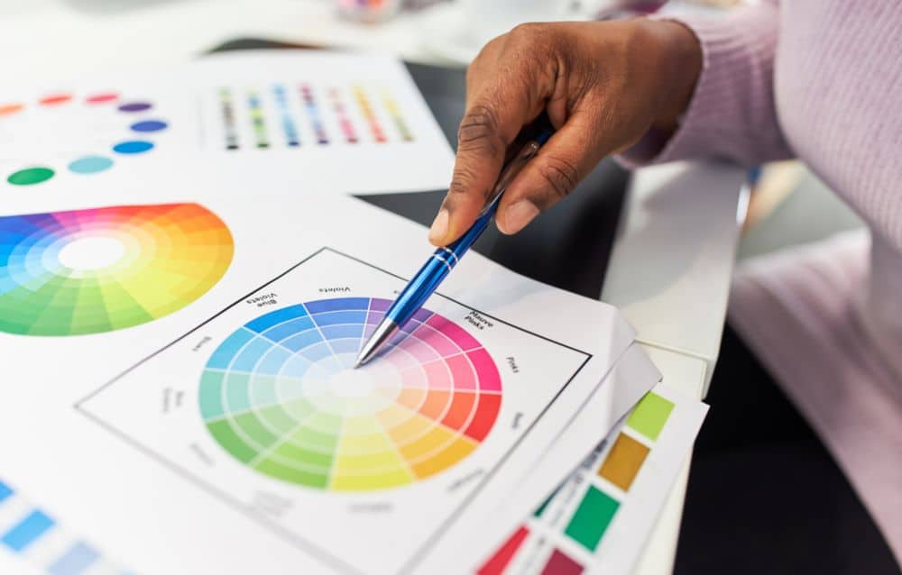
Primary, Secondary, and Tertiary Colors
The traditional color wheel is structured around three layers:
- Primary Colors: These cannot be created by mixing other colors. In traditional color theory, they are red, yellow, and blue.
- Secondary Colors: Created by mixing equal parts of two primary colors—orange (red + yellow), green (yellow + blue), and violet (blue + red).
- Tertiary Colors: These emerge from mixing a primary with an adjacent secondary color, resulting in hues like red-orange or blue-green.
For interior designers, the color wheel serves as a strategic planning tool, allowing for intentional color selection rather than arbitrary choices.
Color Models: Two Approaches to Understanding Color
When working with color in interior design, it’s essential to recognize the difference between how colors behave in light versus pigment.
Additive Color (RGB)
The additive color model is light-based, starting with darkness and adding colored light to create brightness. This system uses red, green, and blue as its primary colors (RGB) and is primarily relevant to interior design when considering:
- Screen-based presentations of design concepts
- LED lighting installations
- Smart home lighting systems that can change colors
In additive color, combining all primary colors at full intensity creates white—a principle that might seem counterintuitive if you’re accustomed to working with paints.
Subtractive Color (CMYK and RYB)
Subtractive color concerns physical pigments that absorb (subtract) certain wavelengths of light. For interior designers, this is the system at work in:
- Paint selections
- Textile dyes
- Printed materials like wallpaper
Traditional painting uses the RYB (Red-Yellow-Blue) model, while commercial printing relies on CMYK (Cyan-Magenta-Yellow-Key/Black). When all subtractive primaries are mixed, they approach black – absorbing most visible light.
Understanding these models helps designers anticipate how colors will appear under different lighting conditions and in various applications.
Color Properties: The Three Dimensions of Color
Every color has three fundamental properties that interior designers must consider:
Hue
Hue refers to the pure color itself – red, blue, yellow, etc. It’s what we typically mean when we say “color.” In interior design, hue selection often begins the color planning process.
Value
Value describes the lightness or darkness of a color. Adding white creates a tint, while adding black produces a shade. Value contrast is crucial in interior design for:
- Creating focal points
- Enhancing architectural features
- Establishing visual hierarchy within a space
Saturation
Saturation (also called chroma or intensity) refers to a color’s purity or brilliance. Highly saturated colors appear vibrant, while desaturated colors look muted or gray. Controlling saturation helps designers:
- Moderate the emotional impact of strong colors
- Create sophisticated, nuanced color schemes
- Balance statement pieces with complementary backgrounds
Color Harmony: Creating Cohesive Interior Schemes
Color harmony refers to arrangements that are visually pleasing and balanced. For interior designers, these established color schemes provide reliable frameworks for creating cohesive spaces.
Monochromatic Schemes
Using variations in value and saturation of a single hue, monochromatic schemes create serene, sophisticated interiors. This approach:
- Creates a cohesive look with minimal risk of clashing
- Makes small spaces appear larger
- Allows texture and form to become more prominent
A monochromatic bedroom in various shades of blue, for instance, can evoke tranquility while maintaining visual interest through textural contrasts.
Analogous Schemes
Analogous schemes use colors adjacent to each other on the color wheel. This harmony creates:
- Visually comfortable, harmonious environments
- Subtle transitions between spaces
- A sense of seasonal connection (autumn tones, spring freshness)
An analogous living room might combine warm yellows, oranges, and red-oranges for a cozy, inviting atmosphere.
Complementary Schemes
Complementary colors sit opposite each other on the color wheel. This high-contrast pairing:
- Creates vibrant, energetic spaces
- Highlights architectural features
- Provides maximum differentiation between elements
A dining room with deep blue walls and orange accents exemplifies this dynamic pairing, though in practice, designers often soften the contrast by using tints and shades.
Split-Complementary Schemes
This variation uses one color plus the two colors adjacent to its complement. It offers:
- Rich contrast with less tension than pure complementary schemes
- More complexity and nuance
- Greater flexibility in application
A split-complementary living room might feature violet with yellow-green and yellow-orange accents, creating a sophisticated yet lively environment.
Triadic Schemes
Triadic schemes use three colors equally spaced around the color wheel. This approach:
- Provides vibrant contrast even when using tints or shades
- Creates balanced, harmonious interiors
- Offers flexibility for primary, secondary, and accent roles
In children’s spaces, triadic schemes using primary colors can create stimulating environments, while muted triadic schemes work beautifully in contemporary adult spaces.
Tetradic/Double-Complementary Schemes
Using four colors arranged as two complementary pairs, this complex scheme:
- Offers maximum color variation
- Requires careful balance and distribution
- Works best when one color dominates
These sophisticated schemes are challenging to execute but can create richly layered interiors when managed skillfully.
Practical Applications in Interior Design
Understanding color theory provides interior designers with strategic approaches to common design challenges.
Manipulating Spatial Perception
Colors significantly affect how we perceive space:
- Cool colors (blues, greens) recede visually, making spaces feel larger
- Warm colors (reds, oranges) advance, making spaces feel more intimate
- Dark colors on ceilings lower apparent height, while light colors expand it
- Strategic color blocking can visually correct architectural imbalances
A narrow hallway, for instance, can appear wider with a cool color on the long walls and a warmer hue on the end wall.
Creating Psychological Effects
Research in color psychology reveals that different hues elicit specific emotional and physiological responses:
- Blues promote calmness and concentration – ideal for offices and bedrooms
- Yellows stimulate optimism and energy – suitable for kitchens and dining areas
- Greens reduce stress and promote balance – perfect for transitional spaces
- Reds increase appetite and conversation – appropriate for dining rooms in measured doses
These effects should be considered alongside cultural associations and client preferences when developing color schemes.
Addressing Natural and Artificial Light
Light dramatically affects color perception:
- North-facing rooms receive cooler, bluer light that can make cool colors appear more intense
- South-facing spaces get warm, direct sunlight that enhances warm colors
- East and west exposures change dramatically throughout the day
- Artificial lighting types (incandescent, fluorescent, LED) each render colors differently
Professional designers always test colors under the actual lighting conditions of a space before final implementation.
Color and Material Coordination
In interior design, colors rarely exist in isolation:
- Wood tones introduce natural colors that must harmonize with the overall scheme
- Metal finishes (brass, chrome, bronze) contribute distinctive color notes
- Natural stone presents complex, variegated colorways
- Textiles often contain multiple colors that must be balanced
Successful color schemes account for all existing material colors and integrate them into a cohesive whole.
Advanced Considerations for Interior Color Design
Color Proportion and Distribution
The relative amount of each color significantly impacts a scheme’s success:
- The 60-30-10 rule suggests using a dominant color (60%), a secondary color (30%), and an accent color (10%)
- Vertical color distribution affects perceived ceiling height
- Horizontal distribution influences perceived room width
- Color weighting should consider furniture mass and architectural features
Cultural and Historical Context
Colors carry different meanings across cultures and time periods:
- White symbolizes purity in Western contexts but can represent mourning in some Eastern cultures
- Purple historically signified royalty due to the expense of purple dye
- Historical periods feature distinctive color palettes (Victorian, Mid-Century Modern, etc.)
- Regional influences often reflect local natural environments
Sensitivity to these factors helps create spaces that resonate appropriately with their contexts.
Color Trends vs. Timeless Applications
Interior designers must balance trendy colors with enduring appeal:
- Trend colors work well in easily changeable elements (accessories, pillows)
- Neutral backgrounds provide flexibility for evolving color preferences
- Investment pieces often warrant more conservative color choices
- Classic color combinations (navy and white, gray and yellow) have proven longevity
Conclusion
Color theory in interior design is where science meets art – a fascinating intersection of optics, psychology, and aesthetics. While the principles outlined here provide a robust framework, successful application ultimately requires both knowledge and intuition.
The most effective interior color schemes acknowledge theoretical principles while responding sensitively to architectural conditions, natural light, client preferences, and functional requirements. Whether creating a calming bedroom retreat using a monochromatic blue scheme or an energizing dining space with complementary accents, color theory provides the foundation for intentional, impactful design choices.